UrbanismX at Tufts
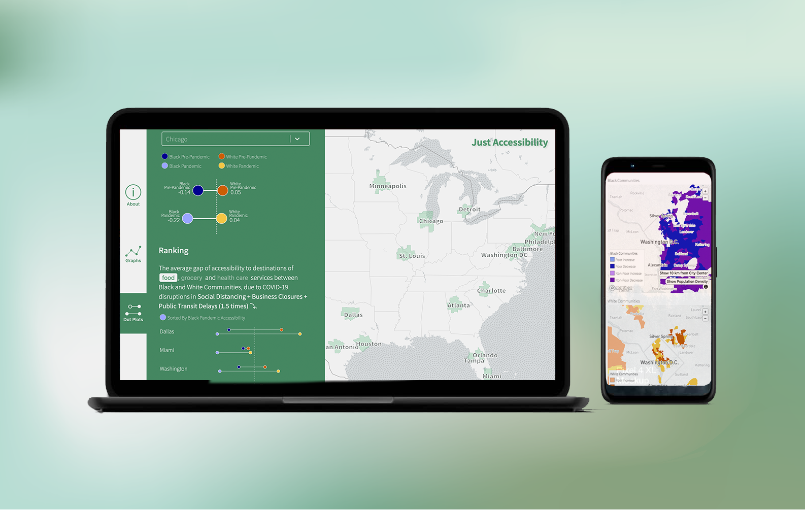
Building an interactive data dashboard built under Dr. Shan Jiang for Tufts University's UrbanismX Research Group . This visualization explores how Covid-19 impacted accessibility to food, grocery and health services in the United States's top twenty-five metropolitan areas.
Duration
5 months
Dec 2020- May 2021
Team Members
Dr. Shan Jiang
(Principle Investigator)
Jianying Wang
(Research Lead)
Priya Misner
(Website and Visualization)
Tasks
Designed charts, maps, and user flow based on an exisiting research paper and data.
Coded the data dashboard for both web and mobile screens.
Tools
Figma
Mapbox
React
React Map GL
d3.js
python
The Challenge
Dr. Shan Jiang approached me at the end of 2020 to develop a visualization for her lab's research into the impact of the Covid-19 pandemic on access to services like food, grocery and health care in cities. A draft of a research paper existed when I came on board, as did a powerpoint with preliminary findings.
The challenge: to transform the static images and text from a research paper into a tool that allowed researchers to explore the multitude of variables studied but also told a story about the research to other practitioners in the urban planning field. I wanted the visualization to entice people to play around with the various variables while discovering the impact Covid-19 had on food, grocery and health care accessibility.
From Data to Design
With twenty-five cities worth of .csv files to Excel sheets with rows of statistics to the conclusions drawn in the research paper draft, there was a lot of information to sort through before any thought of design could begin. Armed with the graphing capabilities of Excel, kepler.gl, and a notebook, I realized that the data files could be easily split into two groups. One set of data compared the cities to each other while the geographical data displayed how areas of a specific city had changed during the pandemic.
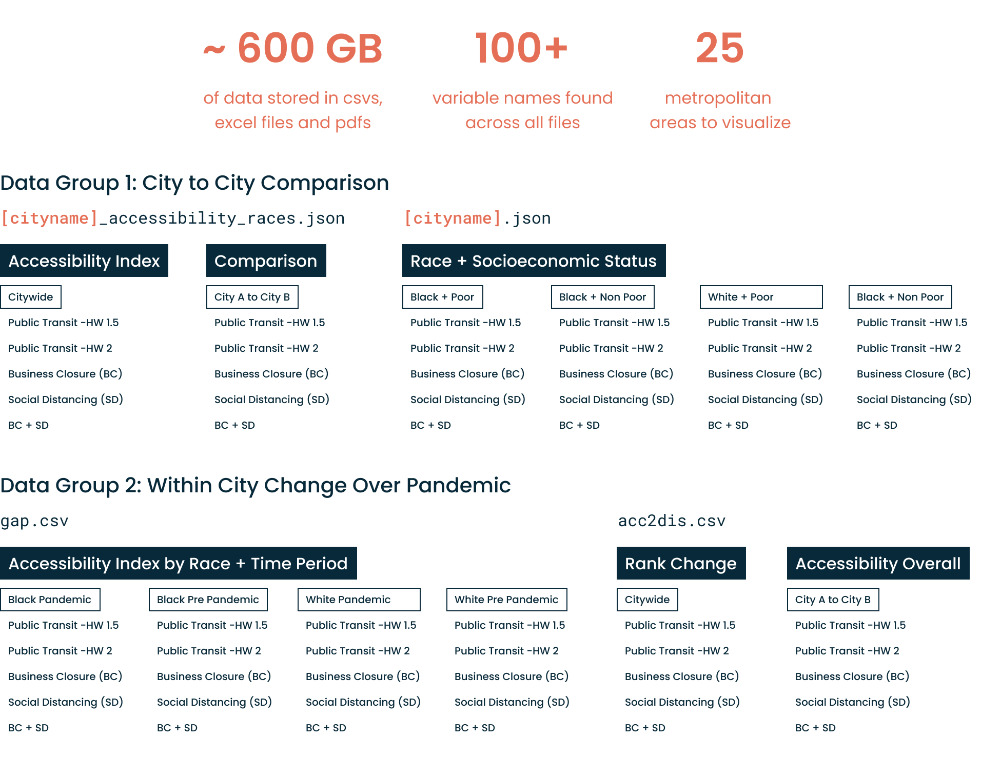
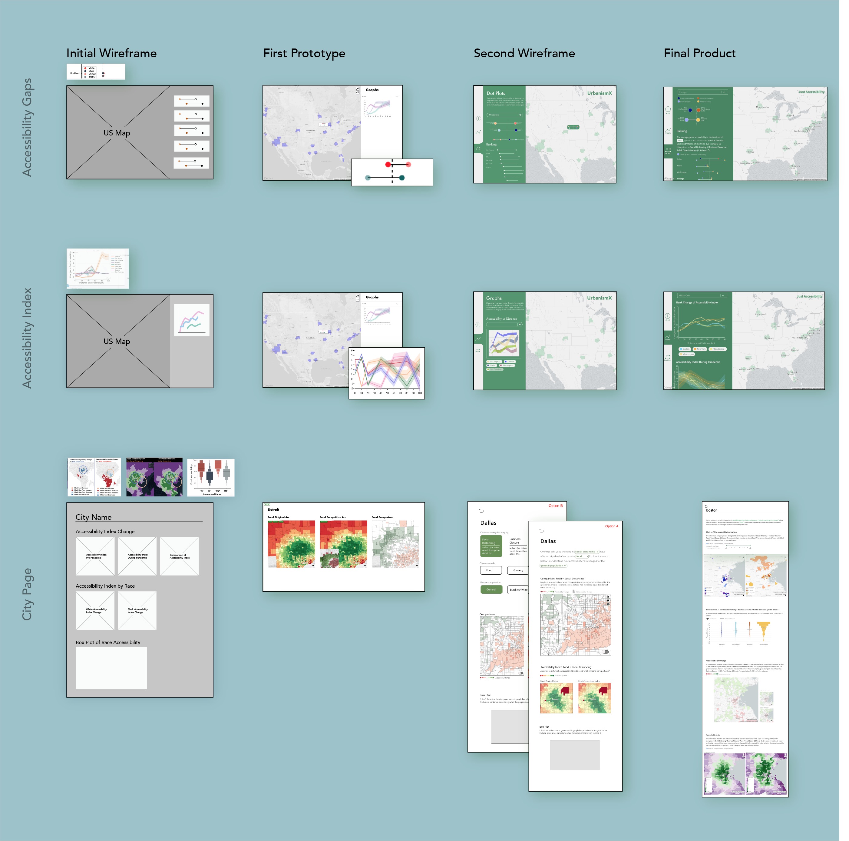
The flow of the app had to account for the two different data perspectives. Before jumping into the design of the chart and map components, I sketched out some wireframes of the dashboard using the original graphics from the research paper draft as placeholders.
The initial wireframes provided a good structure to the project but now the finer details had to be ironed out. In the initial prototypes, users were able to display both the accessibility rank index graph and the accessibility gap plots at the same time. The amount of data being displayed became overwhelming. Later versions of the dashboard split the graph and dot plots into separate tabs.
A Closer Look: Charts and Maps
Three of the more interesting graphics developed for the Just Accessibility dashboard are highlighted in this section.
Black vs White Accessibility Comparison
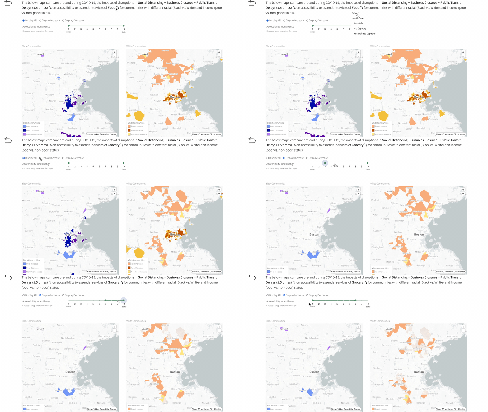
This map uses both color and interactive buttons to display the geographical areas where the pandemic impacted resident's access to Grocery services.
This map also uses a slider to display the Accessibility Index of geographical tracts. I experimented with making the map three-dimensiona; where height represented Accessibility Index but the slider was a much more understandable solution.
Accessibility Index
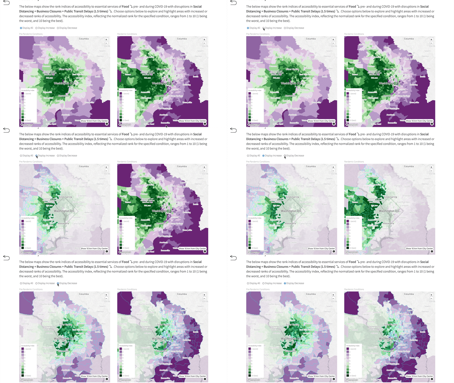
The Accessibility Index map displays the Accessibility Index (rated from 1 to 10) using a diverging color gradient. By toggling Display Increase and Display Decrease, most city maps follow the trend that the suburbs improved in accessibility during the pandemic while accessibility in a city's center worsened.
Accessibility Index vs Distance from City Center
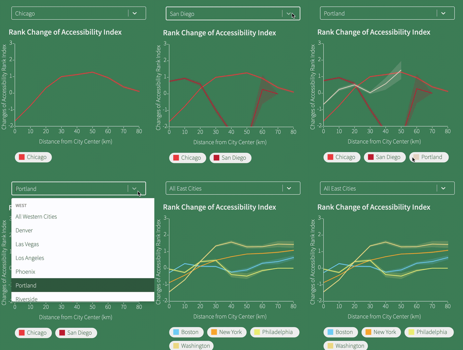
Showing the relationship between Accessibility Index and distance from a city's center, this line graph allows users to add and remove cities at will. Other features include adding a geographic group of cities and highlighting specific cities on click.
Development Details
This dashboard was built using React as the frontend framework. The package React-Map-GL was used to allow the feature's of Mapbox GL JS to be used inside a React application. All graphs and charts were built with the help of d3.js . Major thanks to Amanda Wattenberger's article on using React and d3.js together. Dropdown menus were created using the react-select package and the navigation icons were modified from The Noun Project.