Transit Networks
Prototype network flow visualization built with deck.gl and React for the UrbanismX Research Group
Project Background
During the Fall of 2019 and Spring of 2020 I worked with several professors and researchers from the Tufts University UrbanismX Research Group on an interactive map. In my time working with this group, I created wireframes of how the application should look and coded functional prototypes of two mapping features. The primary goal of this map was to allow urban planning researchers to compare different data sets and visualize the how different variables affected commuter flow. Questions the maps tried to answer included:
→ How can we tell if a city thriving?
→ How does commuting impact a person's life in terms of economic structure?
→ What differences do variables like income, race, occupation, transit mode, etc. reveal about people's commuting patterns?
Network Flow Map Prototype

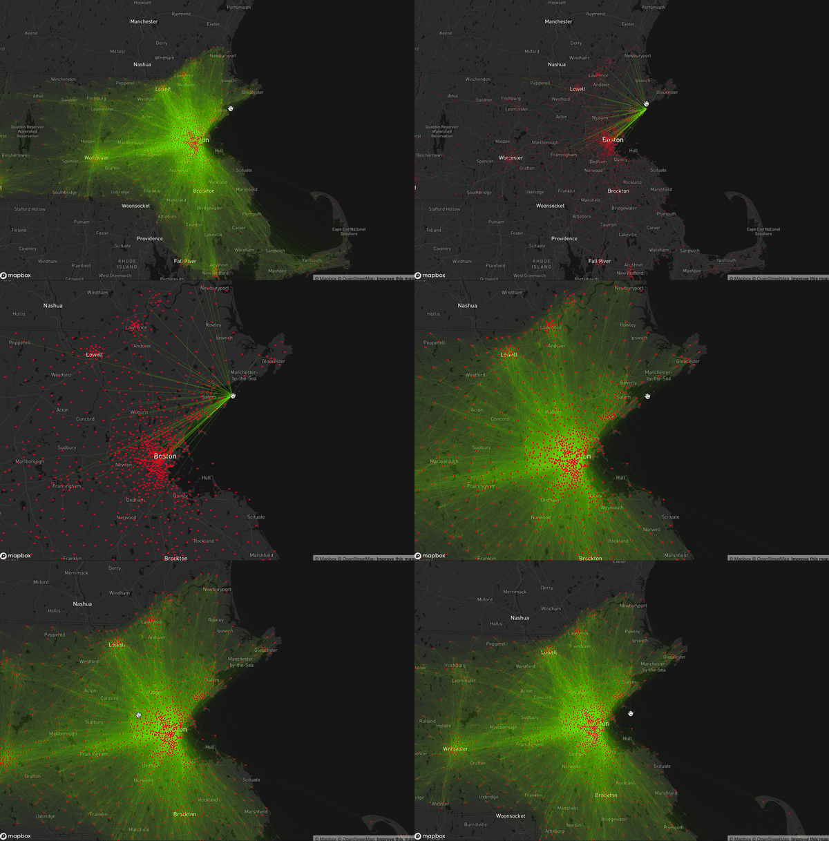
Flow is the movement of a person from an origin point to a destination. The map below shows flow from an origin tract to a variety of destination tracts in Massachusetts. By clicking a point on the map, all the various destinations branch out from the point.
Comparison Map Prototype

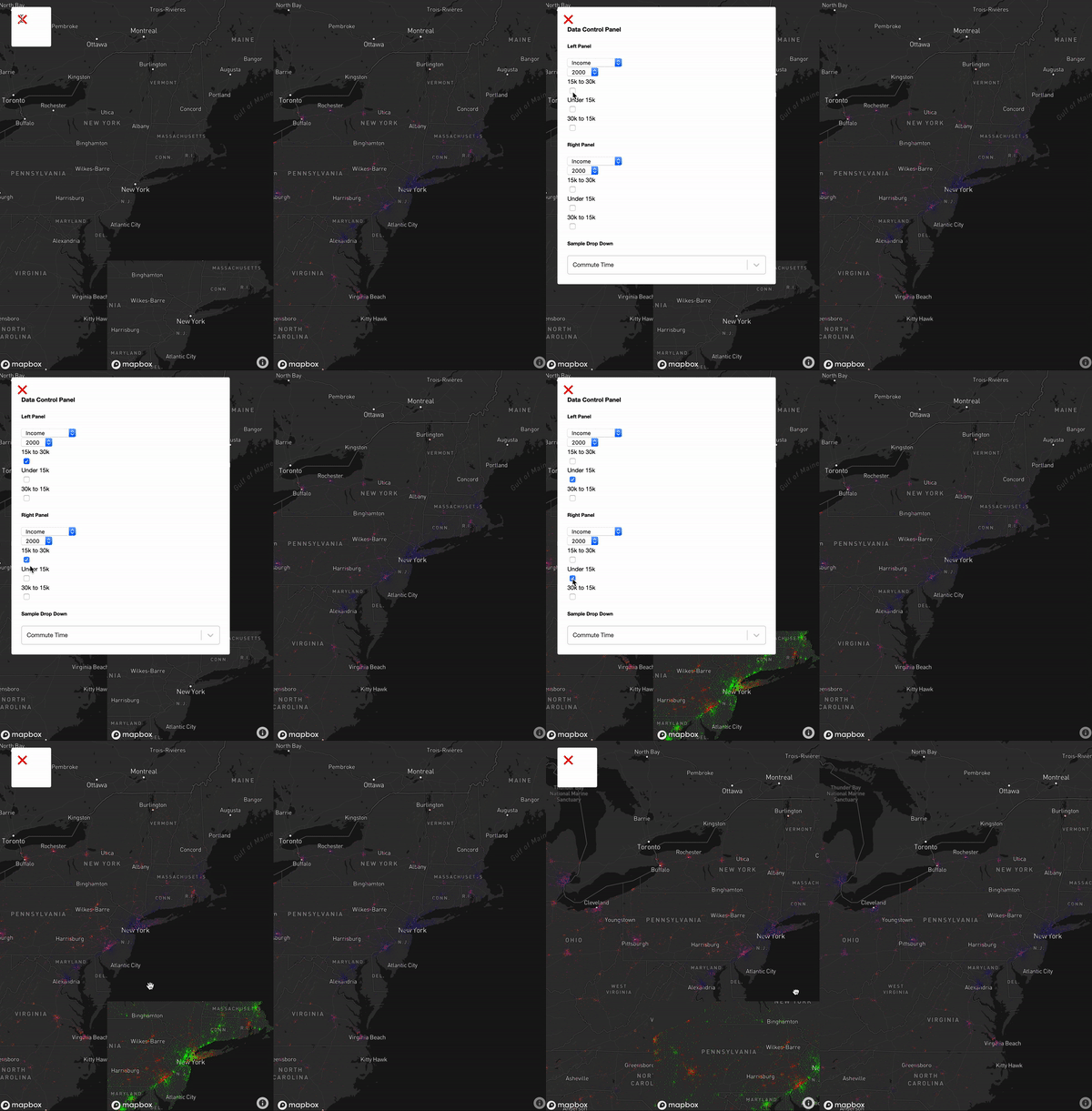
One data set is compared to another data set and the difference between the two maps is shown in an inset map. As you can seen from the image, the user chooses the two data sets they would like to compare from a drop down menu. Both data sets are graphed on a split screen and the difference is shown on an inset map.
Development
I built the map using React and deck.gl, a WebGL-powered visualization framework for large scale datasets. Though the data I received was mostly clean and formatted, I used python with pandas to perform minor data cleaning operations.