Gro Intelligence
A peek into some of the projects I've worked on. Working across agriculture, climate and economic data, I've designed experiences from the tiniest of micro-visualizations to overhauling the way we communicate the climate's impact on crop health.
Note: As much of my work at Gro dealt with proprietary data, the images and content presented have been adjusted or changed to protect confidentiality.
Beyond Dashboards: Effective Information Design

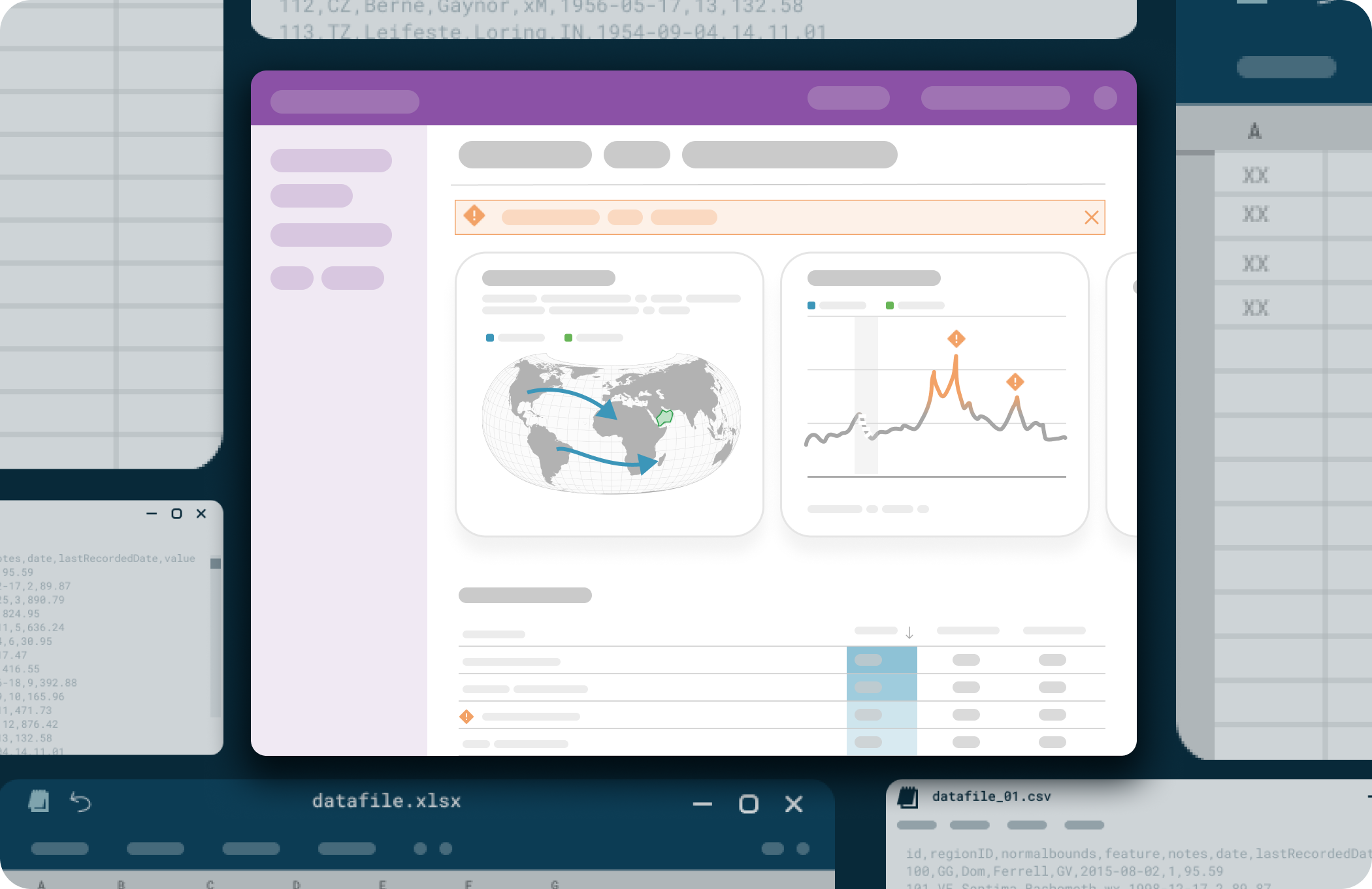
When handling a large volume of data, simply visualizing the information in chart form is no longer enough. Helping users understand what to look at (and when!) becomes just as important as having access to the raw data. In this spirit, I led an effort to redesign how Gro presents it's data. Rather than seeing all the data at once, the new layout begins with a summarized overview at the top level and let user dig into the details as necessary.

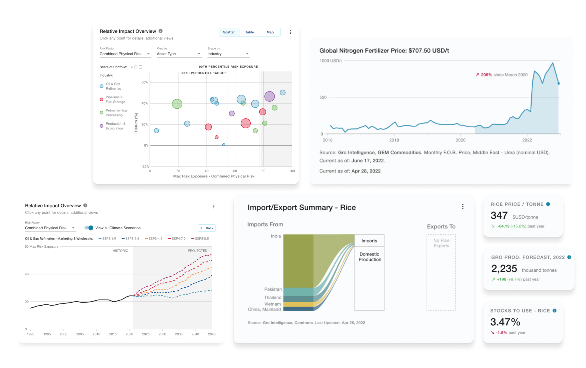
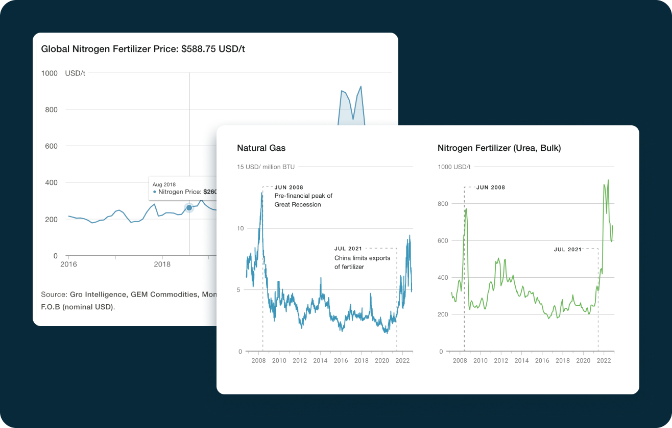
Further, when communicating technical information to an audience with a wide range of understanding, helping users understand and evaluate the data they are seeing is key to demonstrating value. To that end, I worked on designing visualizations specific type of data: aka pricing, weather data, climate projections, etc. By moving away from a one template fits all approach, I was able to limit the amount of explanatory text on a chart while increasing user understanding of the data they were seeing.
Chart Design System

A design system dealing with basic UI elements and typography was already in place when I joined Gro. Due to the expansive amount of topics and data types Gro works with, chart styles were varied and not standard across products. My task centered on finding a way to lightweight approach to unifying charts at Gro while also allowing for flexibility in terms of screen sizing, data range, chart type (line, bar, area, etc.) and additional context.
Interactive features like an x-axis that changes how the date formatting based on the data range exemplify the philosophy behind this system: providing users with the context relevant to the level they are at but nothing extra.
Throughout the process, I worked closely with stakeholders, subject matter experts and developers to improve the consistency and quality of our standardized data visualization components.
Bespoke Charts + Infographics

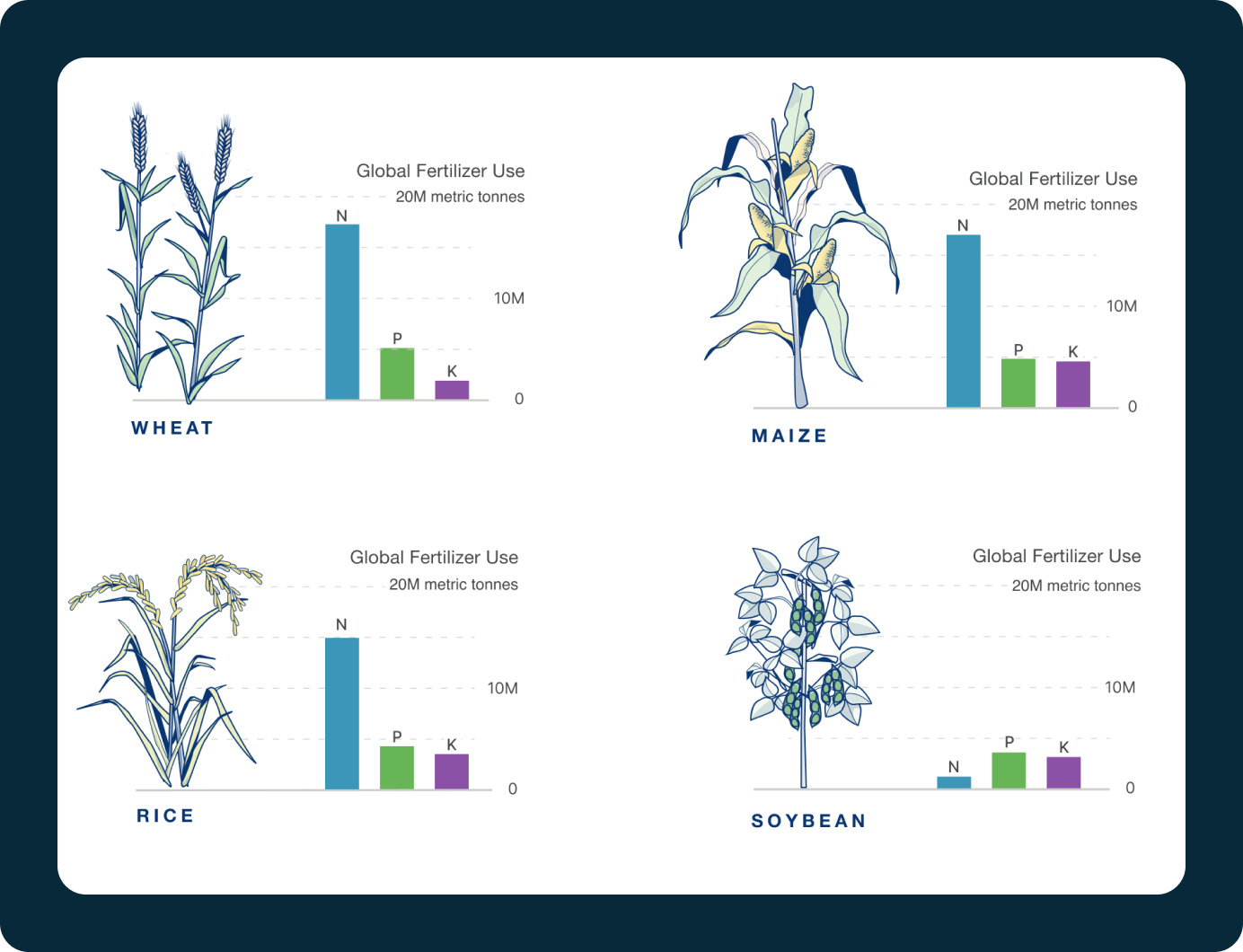
Creating custom charts and visualizations for key projects is a regular part of my work. This involves working closely with the project team and subject matter experts to understand their needs and developing creative solutions (often under tight deadlines!) to communicate complex data in an engaging way.